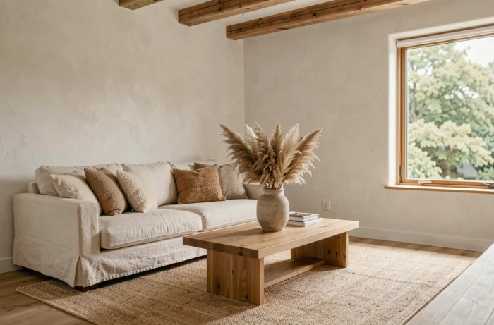
Choosing a wall color, sofa or light fixture often means balancing what you like with what works in a particular space. This article compares the main interior design choices by assessing their real impact on a home’s atmosphere, comfort and overall cohesion, helping you prioritize the decisions that matter.
Wall colors and flooring: their respective impact on how a space feels
Wall colors and flooring are the two largest surfaces in a room. Their interplay has a much greater effect on how spacious a room feels than the furniture does.
| Decorating choice | Visual surface covered | Impact on perceived brightness | Relative cost to change |
|---|---|---|---|
| Wall paint (light shade, off-white) | Very high (walls + ceiling) | High: reflects natural light | Low to moderate |
| Wall paint (dark shade, forest green, midnight blue) | Very high | Reduces brightness and creates depth | Low to moderate |
| Light wood flooring (oak, beech) | High (entire floor area) | Moderate: adds warmth without darkening the room | High (installation + materials) |
| Dark tile or polished concrete | High | Low: absorbs light at floor level | High |
| Indoor blinds (fabric, sheer curtains) | Moderate (windows) | Varies depending on opacity and color | Low |
Off-white walls paired with light wood flooring increase light reflection in north-facing rooms. Conversely, a dark shade on just one wall is enough to visually reshape a space without sacrificing overall brightness.
Flooring is still the most expensive feature to change later. It’s best to choose a neutral, durable finish, then adjust the atmosphere with walls and textiles, which cost less to replace and require less work.
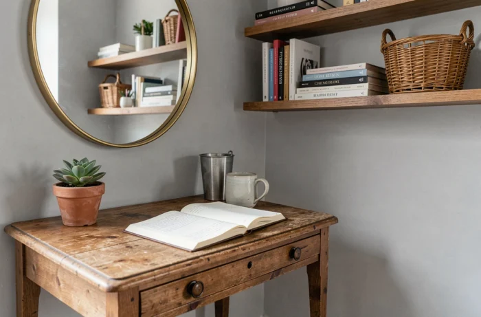
Articles about the home on Monsieur Magazine explore several color-and-material combinations that illustrate how room layouts affect perception.
Air quality and decorating materials: a factor often overlooked in interior design choices
The 2025 national air quality report notes a slight increase in volatile organic compound emissions linked to the residential sector. Paints, adhesives, particleboard and some upholstery fabrics are among the household sources of these pollutants.
Balancing aesthetic choices with indoor air quality is no luxury. Low-VOC certified paint rarely costs more than a standard range from a big-box store. Solid wood furniture (oak, walnut, ash) releases less formaldehyde than melamine-coated particleboard.
For textiles, curtains and cushions made from untreated linen or cotton avoid chemical stain-resistant finishes that release substances into the air. This matters more in smaller homes, where ventilation is more limited.
What to check before buying furniture or flooring
- An A+ label on paints and varnishes, indicating the lowest level of volatile organic compound emissions
- A PEFC or FSC label on wood, ensuring the raw material is traceable and generally associated with less polluting manufacturing processes
- No flame-retardant or stain-resistant treatments on upholstery fabrics that remain in prolonged contact with the skin (sofas, bedding)
Interior design and energy efficiency: two issues that go hand in hand
Since January 1, 2025, homes rated G can no longer be offered for rent in mainland France. Ratings F and E are due to follow in 2028 and 2034. For landlords and residents alike, it’s worth factoring this into any decorating project.
Replacing single-glazed windows with double glazing changes the window frame and, in turn, the types of blinds or curtains that can be used. Insulating a wall from the inside reduces the living area by a few centimeters, which can affect furniture placement in a narrow room.
When energy-efficient renovations shape decorating choices
Adding insulation to the inside of a load-bearing wall means rethinking where to put a bookcase or TV stand. Checking the home’s energy performance certificate before starting a renovation project helps avoid doing the same work twice. For smaller homes, Insee notes that updated energy performance certificate rules may change a property’s rating, particularly for homes heated with electricity.
A cast-iron storage heater, for example, takes up more wall space than a radiant panel but provides greater thermal comfort. This kind of trade-off is as much about decorating as it is about technical considerations: the choice of heating system affects the layout of every room.
Personal objects and wall art: add character without creating clutter
Collecting decorative objects can quickly create visual clutter. The question isn’t how many items to display, but which ones genuinely contribute to a space’s identity.
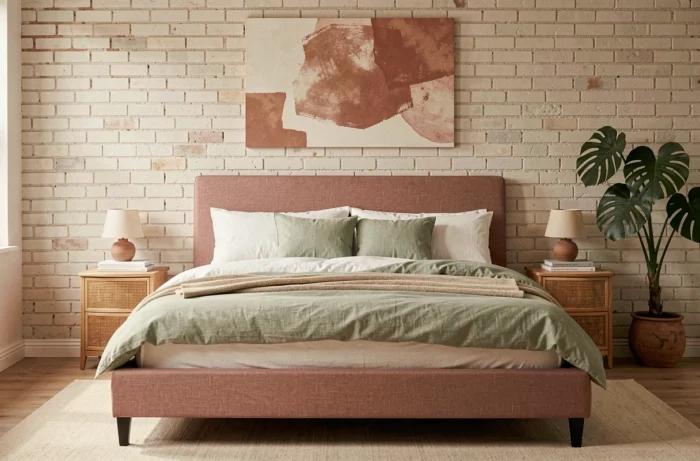
- A large framed print or poster on a main wall draws the eye more effectively than five small frames scattered around
- Souvenirs and heirlooms make more of an impact when grouped on a shelf or in a display cabinet rather than spread throughout the home
- Houseplants add volume and color without making a room feel visually heavy, as long as you limit yourself to three or four varieties per room to keep the space easy to read
A cohesive interior is built around a few carefully chosen pieces, not an accumulation of things. Removing an object can sometimes make a bigger difference than adding one.
It’s best to choose accessory colors (cushions, vases, throws) that echo a shade already in the room, perhaps in the rug or a piece of wall art. This color thread ties everything together without requiring matching furniture.
Interior design comes down to three practical trade-offs: how light is distributed between walls and floors, whether materials are compatible with good air quality, and how to plan for a home’s energy-efficiency requirements. Everything else is about balancing personal objects with open space.